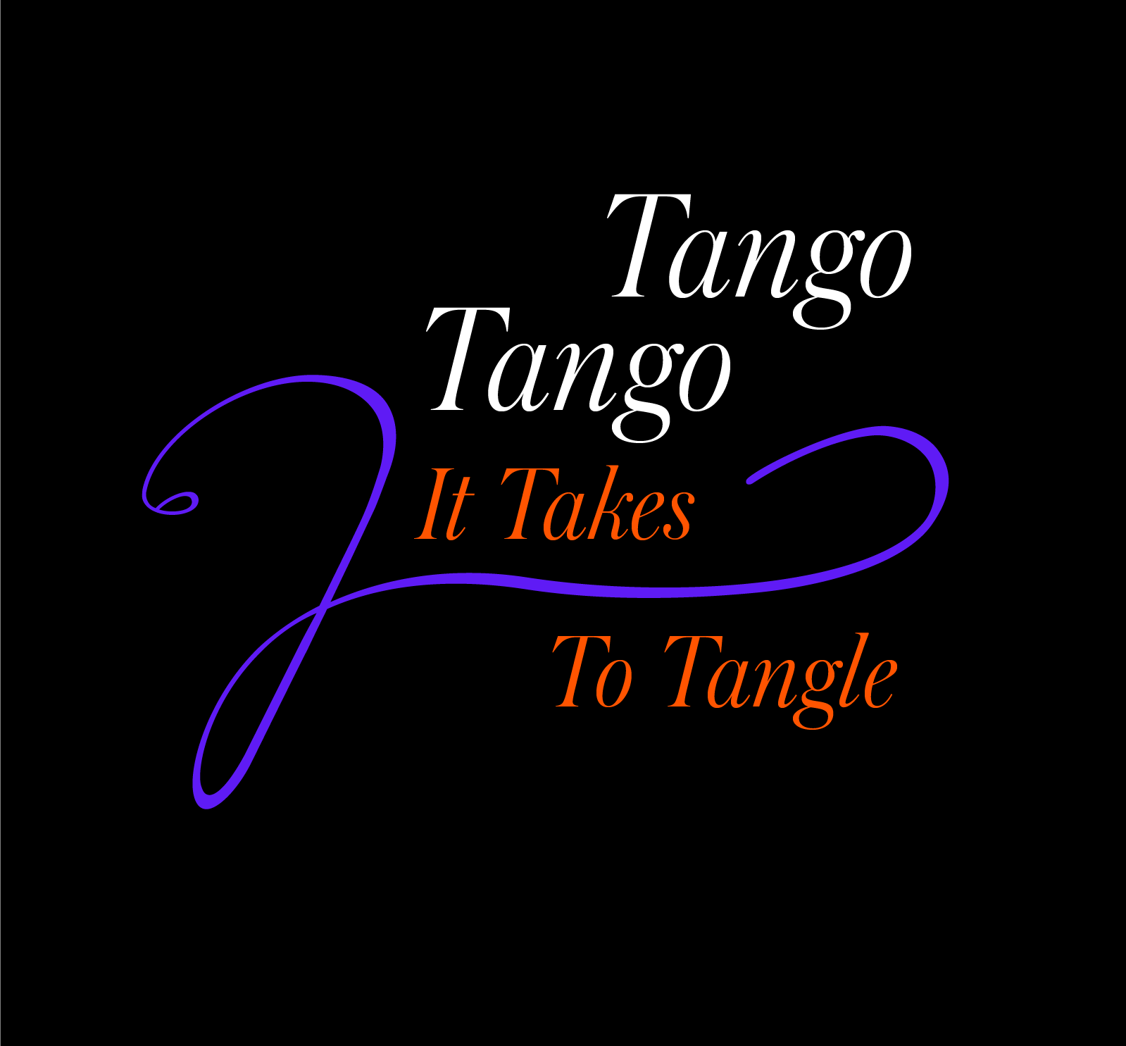
It takes 2 to tangle
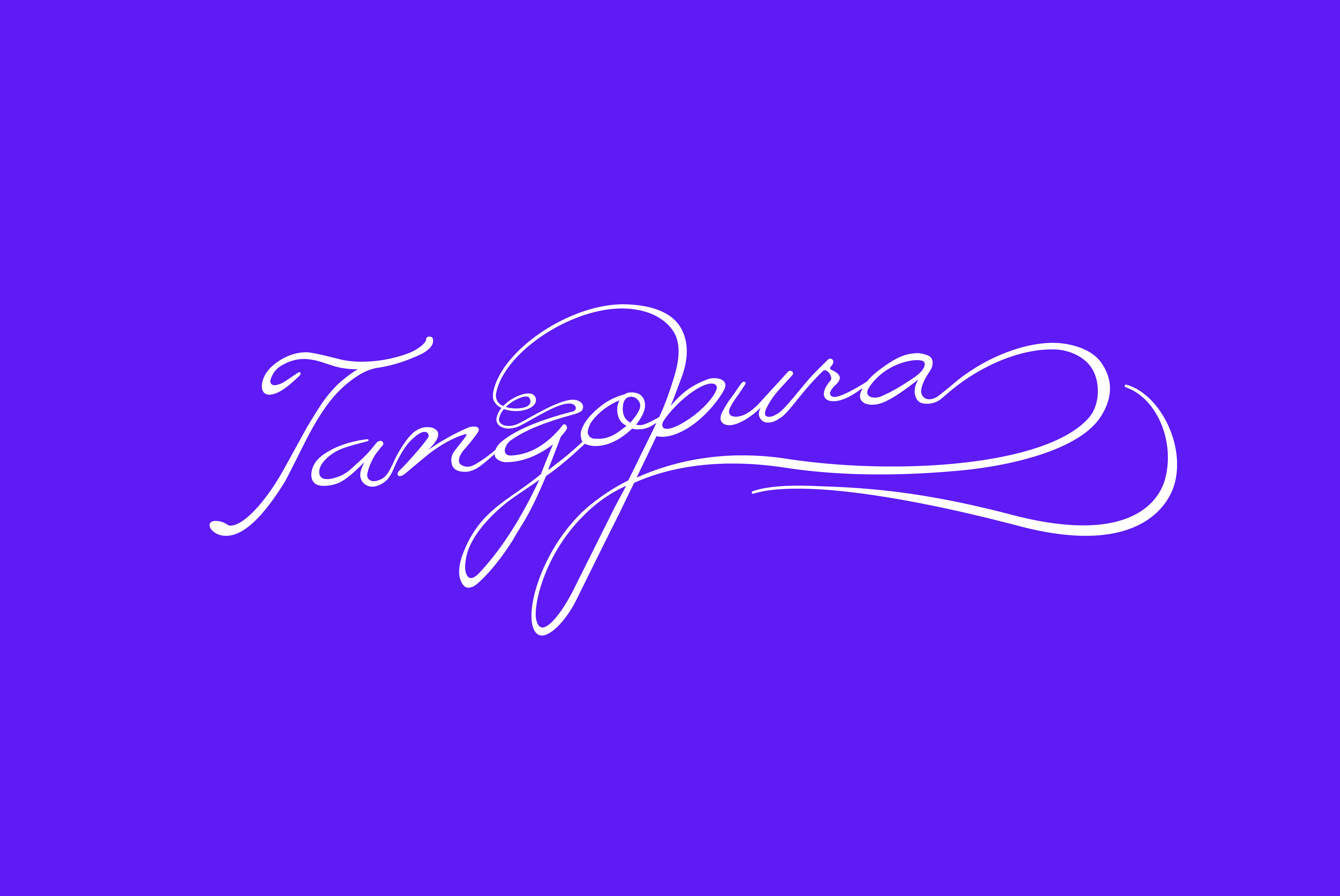
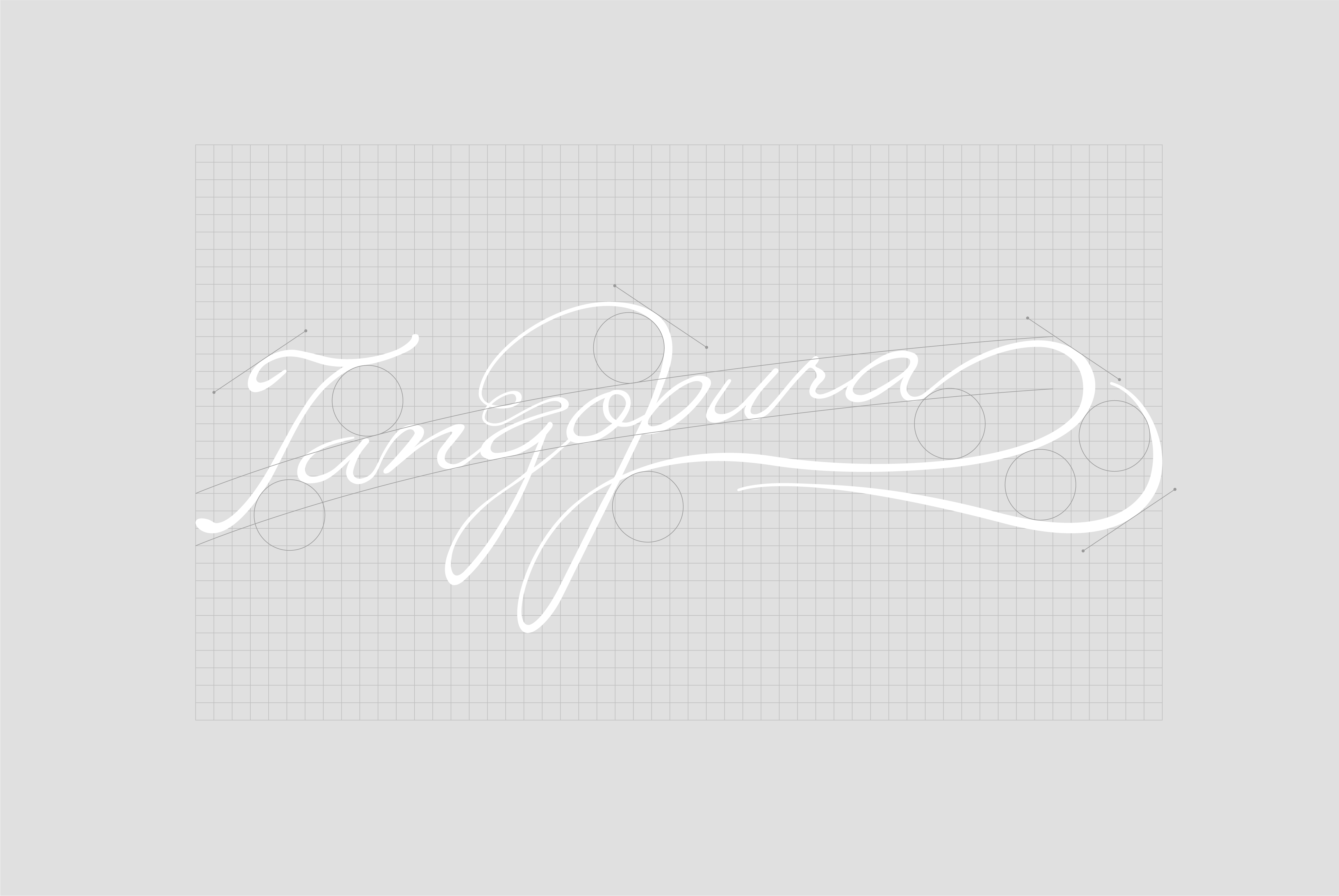
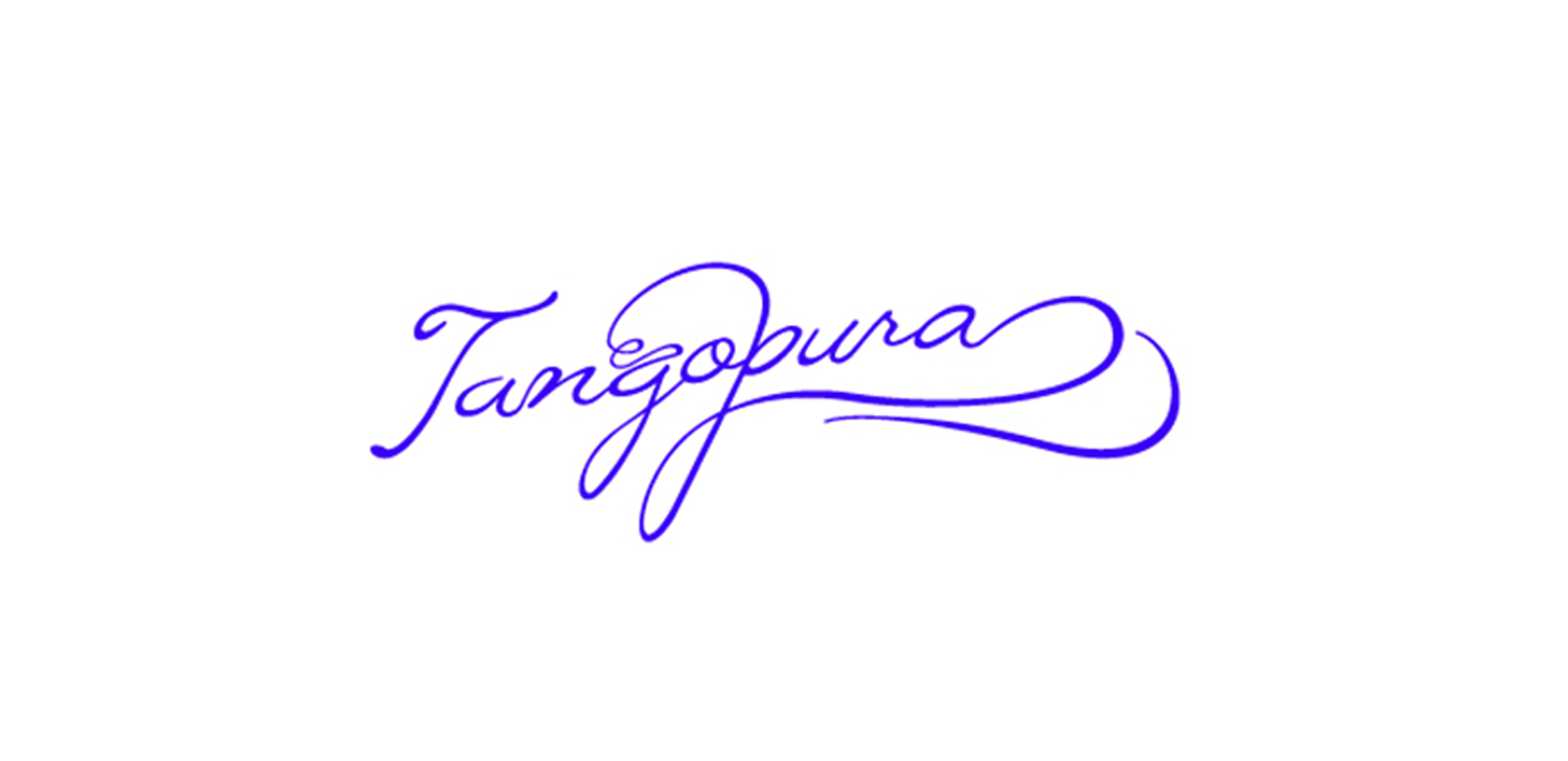
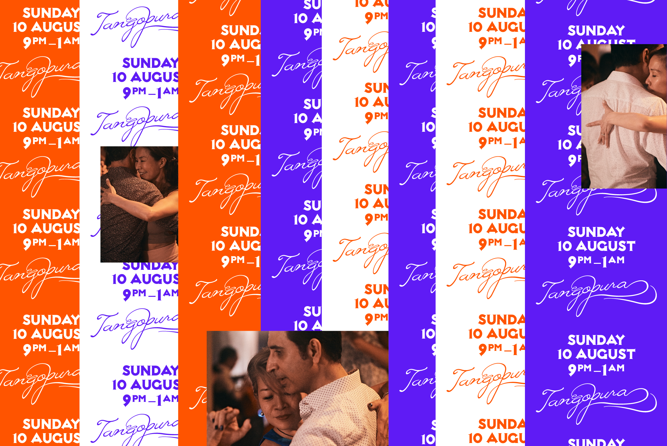
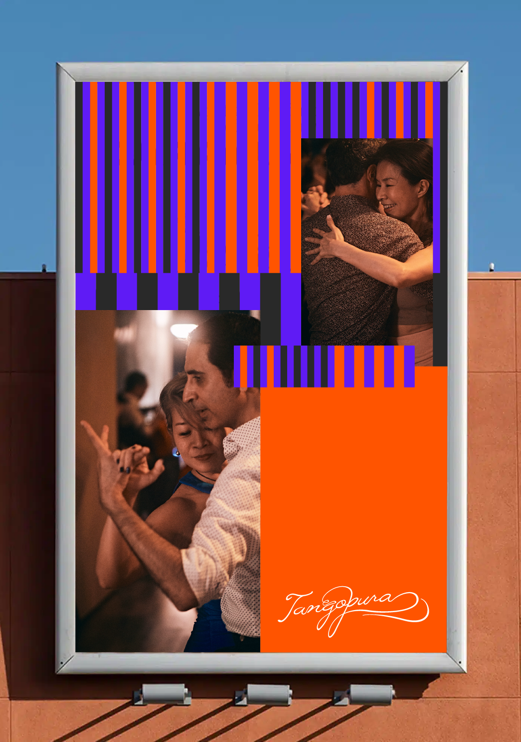
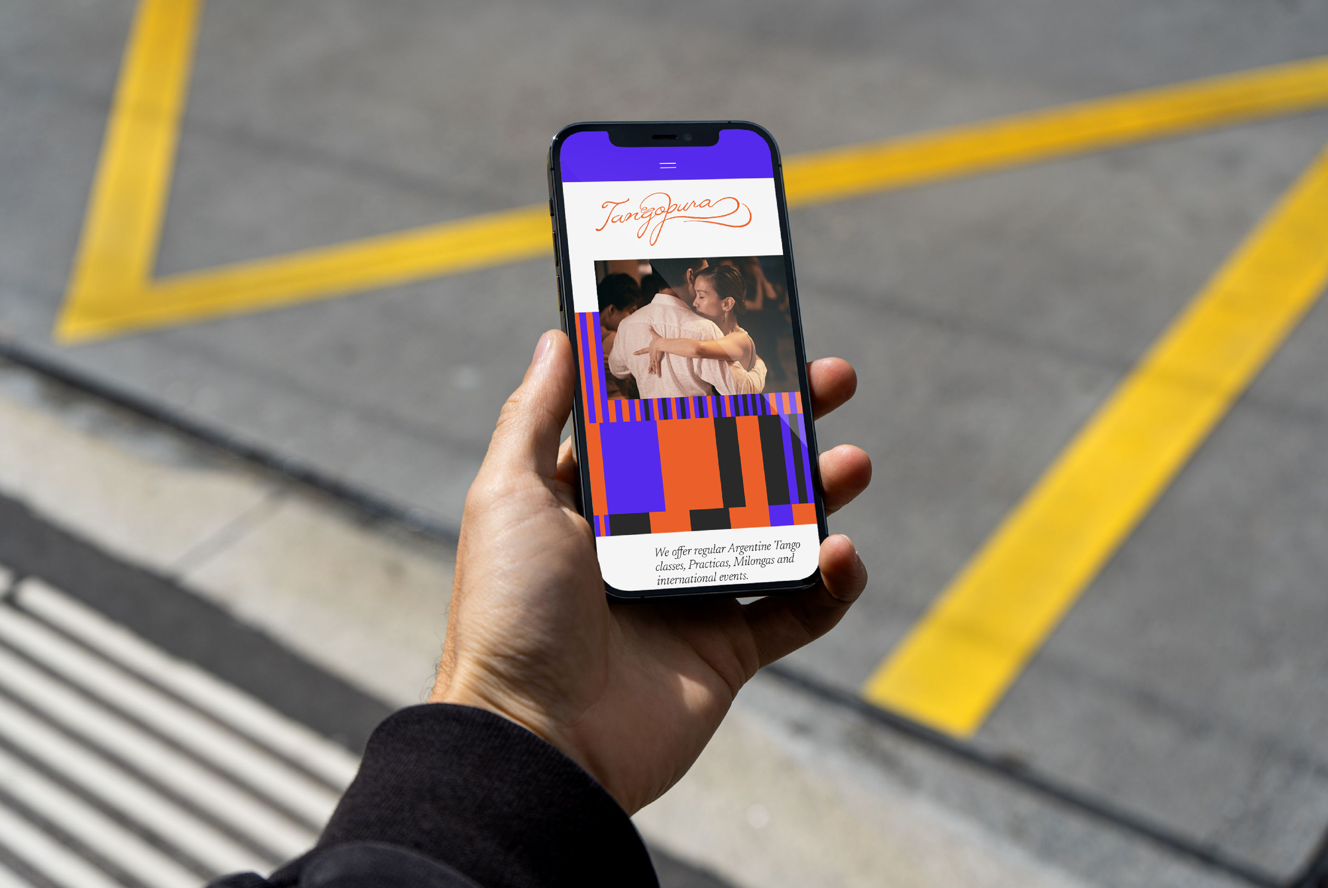
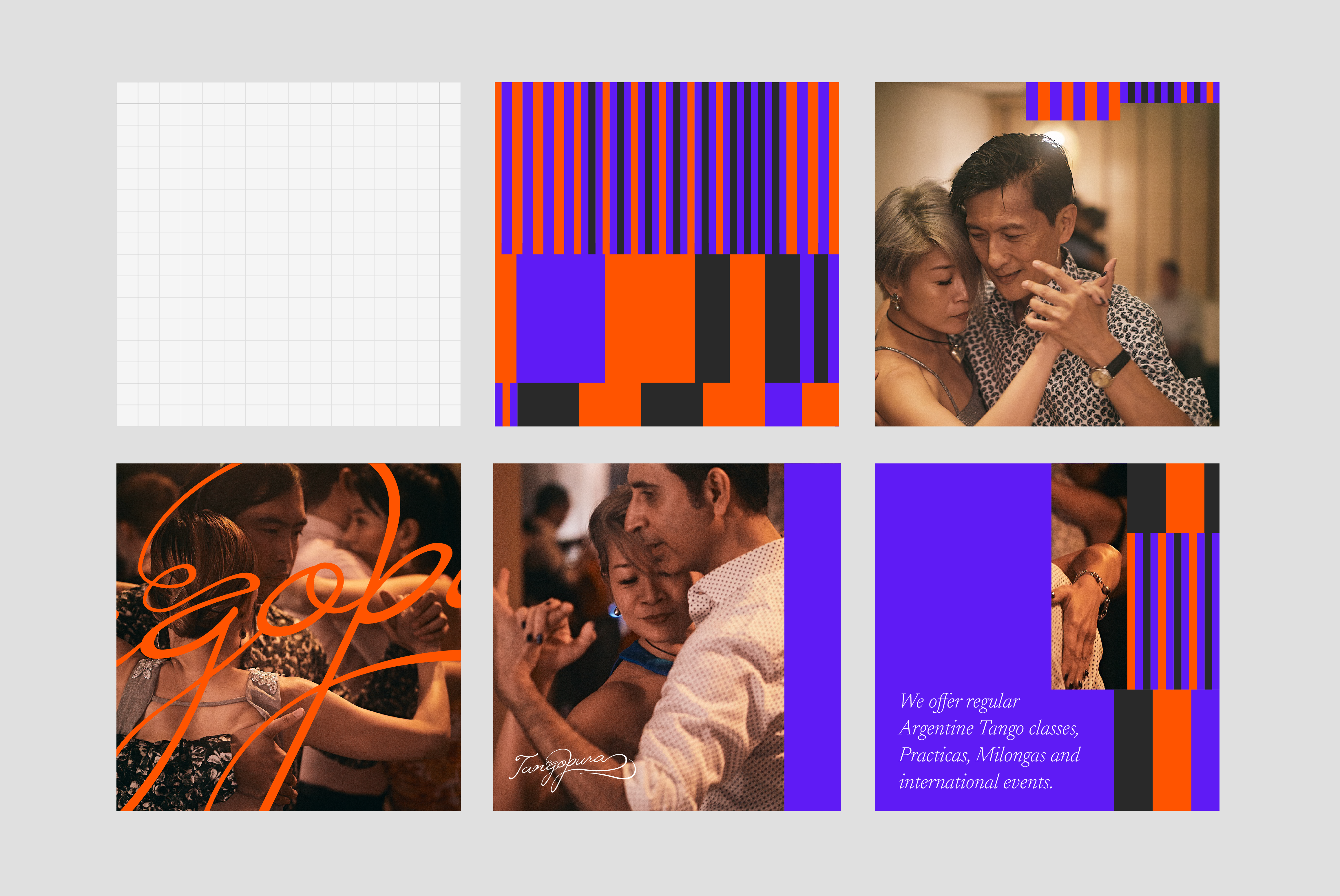
Tangopura
2016
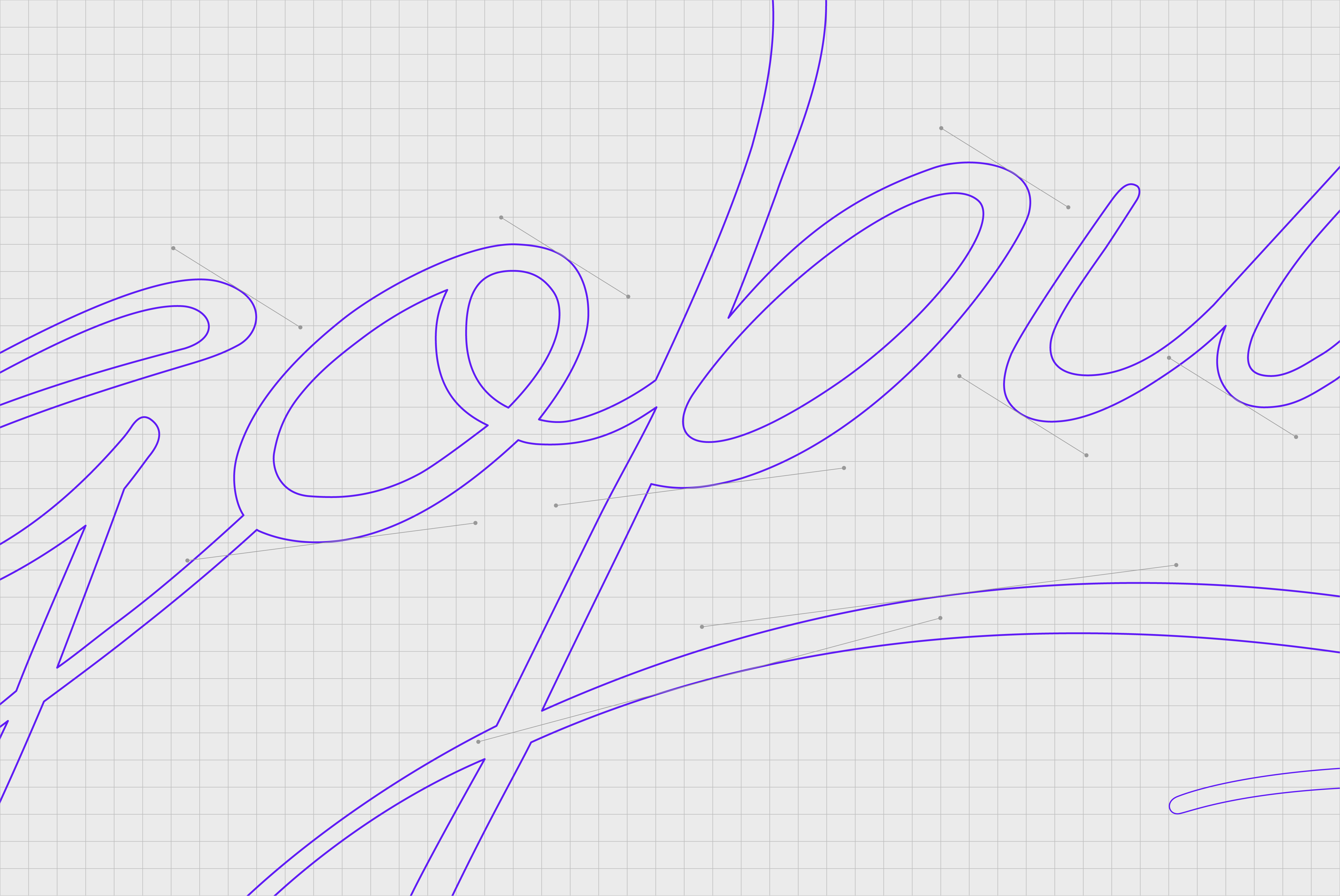
The logo design features an expressive script that incorporates a hidden '2' — reflecting the connections between 2 dancing partners. The typographic swirls mirrors the movements and sensuality inherent in Tango.
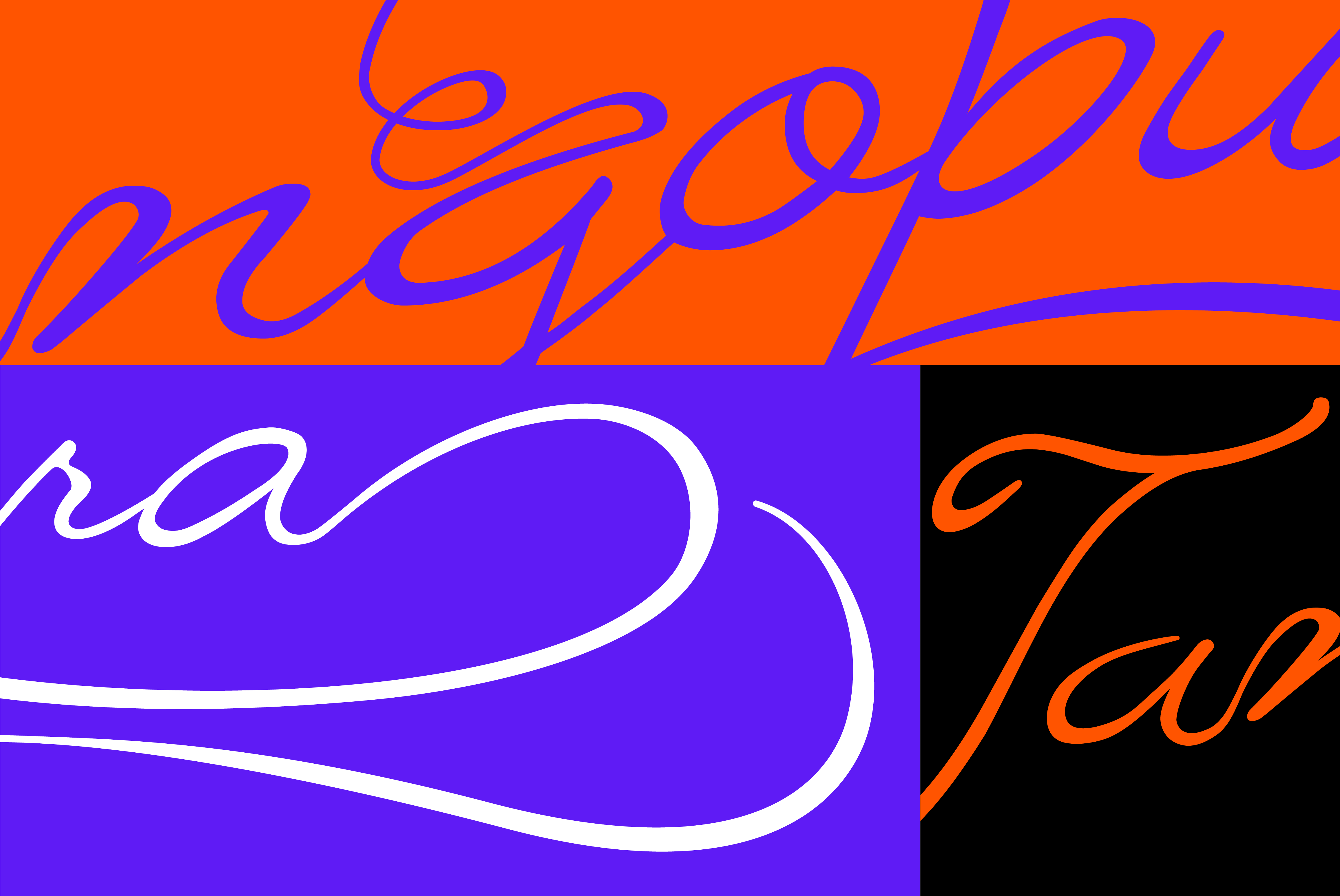
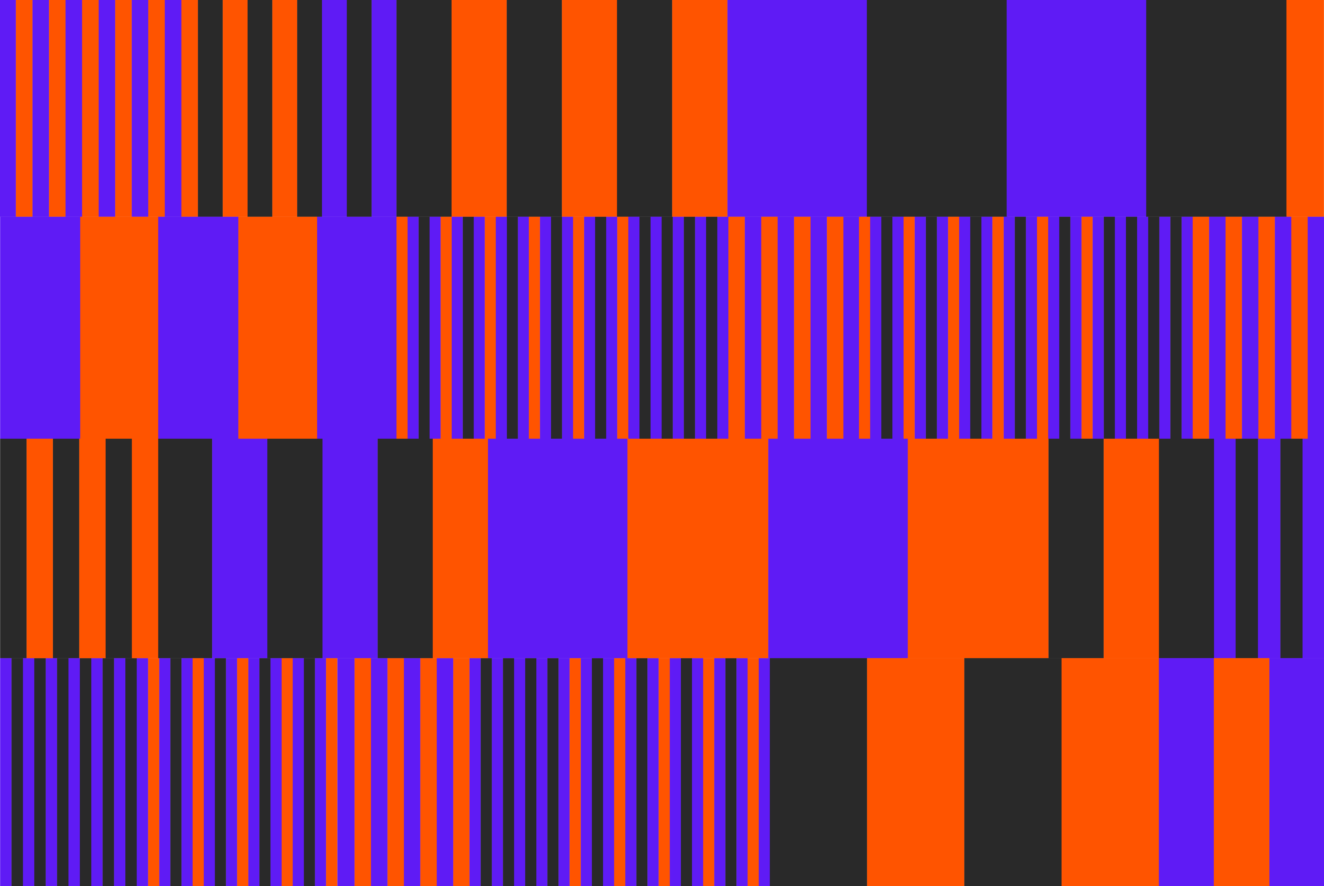
In the supporting brand pattern, rhythmic hues are utilised to create a visual juxtaposition to the flowing logo. This contrast injects a dynamic energy into the visual language, reflecting the lively nature and rhythmic beats of Tango. The combination of these elements results in an identity that captures the essence of Tango's elegance, passion, and rhythmic intensity.